Literature and Latte just released Scrivener version 2.7 for the MAC and this is what’s new:
1. Interface
First of all it’s been made compatible with the next release of OS X. It’s called El Capitán and will be released on September 30.

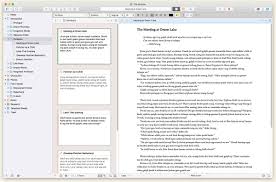
And as you can see the interface has been completely redesigned to resemble the whole OS X Yosemite and beyond look more closely. I think it’s pretty cool. We haven’t had a Scrivener interface update for quite some time, so, it’s nice to have something new to look at.
All windows are where you expect them to be, except the inspector panel control strip over here. It’s been moved from the bottom of the inspector window all the way to the top.

2. Project Format
Probably one of the biggest changes is the new scrivener project format. Version 2.7 introduces a NEW format, that is not backwards compatible. When opening your projects in version 2.7 they are converted into the new format and a back up of the old version is made.

What does it mean for you?
It means you can’t go back to you your old projects once they’re converted for version 2.7 and you also can’t open them on the PC version of scrivener anymore.
This change has been necessary to make your projects compatible with the upcoming mobile version of scrivener.
I’m kind of hoping that means that the iOS version of scrivener is just around the corner but that remains to be seen.
3. Screenwriting Standard Font
Another change is the standard font for screenwriting. Scrivener now uses Courier Prime as standard. Courier prime is a font that’s been invented by screenwriter John August. It’s based on of the looks and spacings of Courier new but it gives you a better reading experience.
Let’s see how that looks.
I have a scene here in Courier new Standard 12 point. I’m going to change a part of it to courier prime to show you the difference. As you can see Courier Prime is easier to read on a screen because the lines are a bit thicker and some small details of Courier New have been smoothed out to be easier on the eye.

If you don’t like it you can always go back to whichever font you prefer, just go to Format – Scriptwriting – Script Settings and change it.

By the way if you compile a script for Final Draft, Scrivener will strip the font information and if you open your script in final draft it’ll be displayed in standard Courier Final Draft.
These are the biggest changes in scrivener 2.7. To get a full list just follow on of the links below.
Literature and Latte support site: http://www.literatureandlatte.com/support.php
Scrivener 2.7 Documentation direct link (pdf): http://www.literatureandlatte.com/documentation/scrivener-manual-letter.pdf
How do you like the new version of Scrivener? Have you updated yet? Leave a comment below…


Breaks compatibility with Windows version? Is there an intention to update the Windows version to restore cross platform projects? This may push me back to Word, which not only has cloud support but is OS independent and already on iOS.
Hi Rick,
according to Literature and Latte there will be an update out “soon” to fix this issue for PC users. In the meantime there is a public beta release that is compatible with the 2.7 version for Mac.
Hi Rick,
Version 1.9 for the PC is out now and it’s compatible again to the MAC. You can read the post here: https://writersterritory.com/2015/10/whats-new-in-scrivener-1-9-for-pc/
I really appreciate this post. I have been looking everywhere for this! Thank goodness I found it on Bing. You have made my day! Thx again! edagdgcgacceddkc
You’re welcome. I’m happy you like it!